

Design System - Blake
Global Elements
The navigation bar is developed, accounting for flexibility to accommodate simple to complex (multi-level) navigation for the spectrum of Edifecs applications.
Component Specs Guide
I designed the Big Book of Blake Specs Handbook for component developers and designers.
Spacing, Alignment, Text Style, Shape Style, Flexible Space
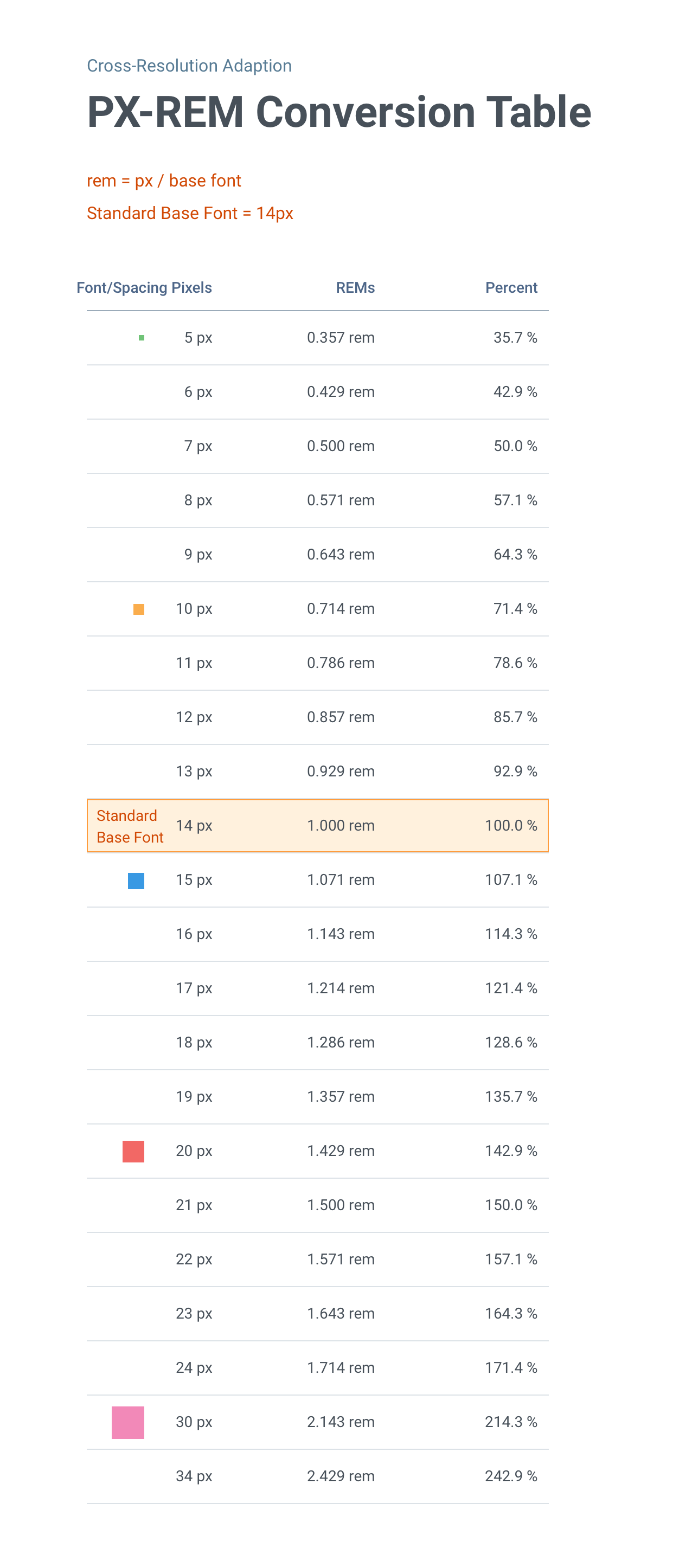
Cross Resolution Adoption
Accounted for base REM breakpoints for different screen resolutions with pixel to REM conversion standards
The moment I stepped into the design leader role in 2016, the first thing I wanted to address was the inconsistent user experience design and practice across products. Since then I have been designing and leading the Edifecs design system ‘Blake‘ for enterprise SaaS products. Today, Blake is functioning as a comprehensive design system accounting for user experience unification and accessibility enabling the experience design needs for web and mobile applications at Edifecs.
Problem Statement
Inconsistent design language being used across products that include Icons, text style, visual specs for UI components, and micro-Interactions.
Lack of unified frontend development framework. Redundant effort across the engineering group to develop similar components.
Products were not accessibility compliant with WCAG 2.1 AA
Approach
I started with an in-depth analysis of the component, layouts and patterns being used across products and then
Established the content & icon style guide, component specs, design patterns and usage guidelines.
Developed the design toolkit and layout templates along with the processes to support design system usage among designers, product managers and developers. Currently leading the ongoing additions & enhancements.
Developed and conducted training programs/brown-bag sessions on unified UX design/accessibility/design System
I worked closely with the engineering team to develop the unified frontend development framework based on PrimeNG(Angular JS)
I started the unified UX design compliance program to ensure product adherence by working closely with the product council and stakeholders from engineering.
Result
Today, this design system is being used across product lines (16 products) by 100+ customers, serving millions of plan members.
Designers are focused on problem-solving and overall turnaround time for design is improved by 30-40%
Our customers are calling out the seamless transition between products.
Need for redlines is almost eliminated. Developers are clear on expected visual design and interactions, saving time for both parties.
My Role: UX Strategist, UX Designer, Researcher, Champion & Advocate
Design Toolkit to Enable Productivity & Consistency
Initially, I started developing a design system in sketch which eventually became a sophisticated toolkit for designers, including 300+ components and compositions with embedded VD/ID specs. Last year, I managed the migration of the design system to Figmawith with minimal disruption in ongoing project deliverables. Now Figma is being used as a defacto tool for wireframing and prototyping.
Mobile Design System
I extended the blake design systems for mobile, keeping in mind fundamental design principles like touch target size, minimum data input, progressive disclosure, and hand accessibility (thumb reach).
Centralized Icons & Graphics Repository
I established the icon’s style accounting for accessibility and inclusive needs. Defined the comprehensive icon library which included action, status and header icons. I established the centralized icon and graphics repository to ensure consistent usage across all the products. I ensured that icons were WCAG AA compliant
Standard Charting Library & Patterns
Defined the structured format for charging display and guidelines for the usage across scenarios
Contemporary UX Patterns
I established contemporary design patterns were established to address next-generation experience needs. For example data summary for list pages and summary bar by object details pages.
Web/Mobile